123inkt.nl – UX case study
UX Design + Research | Case study
– Problem Definition
– User Research
– Rapid Prototyping
– Wireframing
– Visual Design
Introduction
Even though media and communication in general get more and more digitized, once in a while we still just want/need to print. It might even be so that a company or process even simply relies on stuff being printed all the time. That’s where ordering cartridges and toners come in, because one can’t print without. The conscious consumer that I am I want to know where I can find the cheapest products that I need.
The webshop of 123inkt.nl is one of those places.
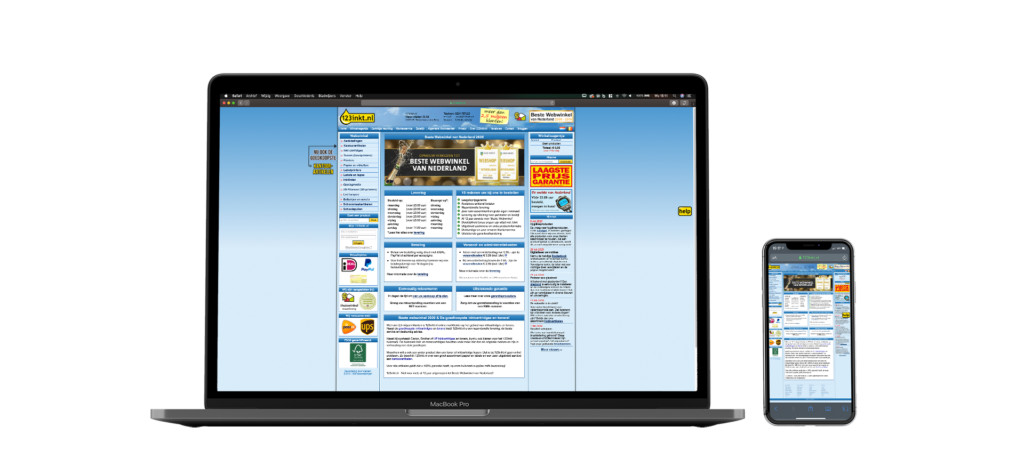
And by having a glance at the pages of 123ink.nl it would be an easy thing to say it’s an outdated looking website. The second thing I notice though is the big banner that shows off their Shopping Award. For 11 years in a row 123inkt.nl managed to rise to the top of the e-commerce landscape of The Netherlands ánd stay there! The award of being the best webshop – in computer, hard- and software – is based on the publics opinion, in other words; the actual users of the webshop. It’s unlike an award that’s handed out by a board of industry peers.
I find that very interesting, because as an UX designer I am trained to spot problems, to – for example – see where user flow has hiccups, to note where there’s either too much or too little communication. And coming across a website like 123inkt.nl makes my UX antennas point at a bunch of things.
Aim
But without diving into the dated aesthetics and unresponsive page design from the get go, I’m focussing on fully understanding the flow of the webshop when ordering their main product type and all the communication that comes with it. And explore opportunities to enhance the shopping experience on 123ink.nl.
There are many other office products they are offering, but for this case study I’m narrowing it down to just the journey of buying ink cartridges.
Understanding our users
Before I start studying who the actual 123inkt.nl users are I first looked into my own experiences with the webshop and the issues that I had encountered. By doing so, I was able to ask the questions to other users throughout each phase of the development and iteration. This will make sure that the redesign is based on the voices other than my own.
Some questions are:
– What is the main reason people use 123inkt.nl?
– What are they feeling and thinking throughout their purchase process?
– What changes would make the webshop more valuable for the users?
Understanding the challenges
I’ve interviewed people who have recently ordered ink on 123inkt.nl. My goal was to learn about how users interact with the webshop and how they digest information and communication from the pages.
Pain points
One major element that users felt was missing, was the search bar. Eventhough there’s one the homepage, it wasn’t apparent enough for some users. Nowadays people who are in search for a specific product go straight to the search bar, and expect that will lead them straight to their desired product or product category. Instead of leading the potential customer towards the right page in a few – preferably one – clicks, it makes you scan the whole homepage.
A second major issue was browsing through all the different products they’re offering. One interviewee noted that one has to become an expert in cartridges and ink, before you can make choose one option. The abundance of choice was felt confusing and left people in search for an other party that sells ink.

Insights
Going through the information I’ve gathered from the interviews, I revisited the website. And besides spotting the major pain points I was thinking which other type of customer might order from 123inkt.nl. Since offices are the common place for printers I figured the office managers – or the person that orders ink – is a more seasoned hunter for ink.
An office manager I’ve contacted explained that ink usually comes through the supplier of the printer or they just buy heaps of cartridges in one go.
This made me decide to focus on the personal shopper for the remainder of my research. The personal shoppers are like my interviewees; they occasionally have to print a few pages and scout for ink cartridges only once or twice a year. They don’t have a fixed supplier and they don’t have the budget to buy heaps of ink like office managers do.
Domain research
Before I dive into the search for opportunity space I researched how the competition is dealing with their webshops and which platforms have similar customer journeys. I’ve listed them below and added short insights. There are some online stores, such as bol.com and Coolblue, that offer ink as well, but I’ve let them out of this research.
Competitive
– Printabout.nl: obvious product search, clear product overview (filter etc.) and responsive webpages + assistance chatbox
– Sneltoner.nl: medium obvious product search, medium clear product overview (filters) and responsive webpages + assistance chatbox
– Alleeninkt.nl: same experience as Printabout.nl, but no filter options on product overview
Comparative
– Bandenconcurrent: buying tires is similar as buying printer ink; brand/type specific, have medium long lifespan (seasons) and requires same product search possibilities as with buying ink online.
Finding Opportunity space
After gathering all my insights from research and the interview, I started to generate How Might We questions to find an opportunity space. Then, I had one of my interviewees to participate in voting for the ideal HMW question.
How might we help customers to find the right ink for their printer for the right price.
Ideate + sketch
For my ideation process, I came up with as many ideas that could possibly help solve the users’ problems. I did different variations, went about crazy as possible and narrowed down to 4 realistic ideas. Then, one idea was chosen as the potential solution to the problem.
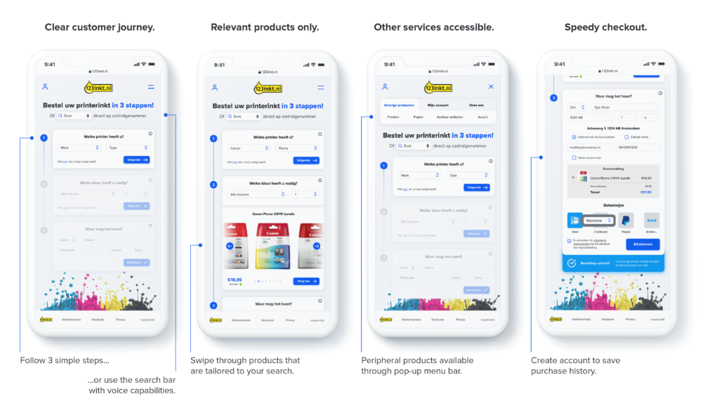
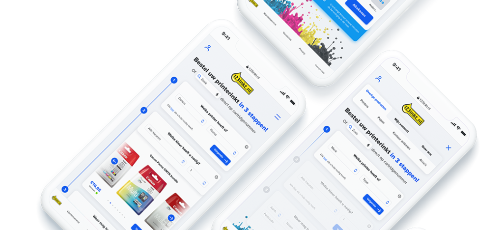
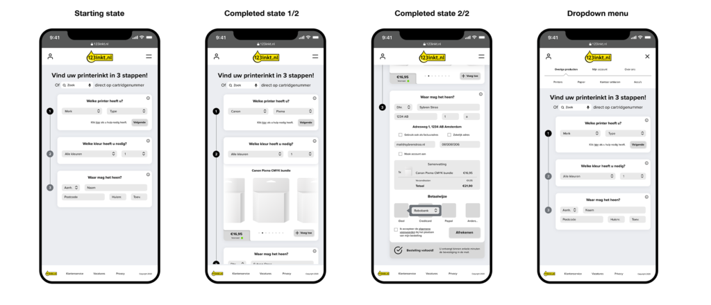
UX concept: 3 step purchase flow
The name of the website is 123ink.nl. After walking through the rest of the process this will again hint at the easy of purchase. So ideally finishing an online ink purchase should consist of 3 steps.
UX Concept

Wireframe draft & ‘3 step’ User Flow
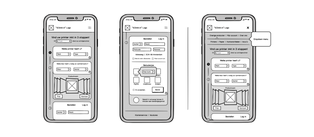
Final wireframe
Visual design
